Years ago I was introduced to the concept of “meaning of colours’ through the festival of Navratri, the theory of the nine Navratan stones and what each colour reflects.
The festival of Navratri honours the Goddess Durga and her nine avatars; it is depicted by nine different colours, representing the nine Avatars. Each day of the week or the nine days of the Navratri festival are represented with a colour. One wears only those colours on the day to honour the different avatars of Goddess Durga.
Monday – White
Tuesday – Red
Wednesday – Green
Thursday – Yellow
Friday – Grey
Saturday – Royal Blue
Sunday – Pink
Or the nine days of Navratri, where the colours are decided every year —
Day-1 Red
Day-2 Royal Blue
Day-3 Yellow
Day-4 Green
Day-5 Grey
Day-6 Orange
Day-7 White
Day-8 Pink
Day-9 Sky Blue
(Times of India 2022)
Another colour theory of the Navratan — Nine different coloured stones are set together as a piece of jewellery in the shape of a flower, each one representing the colours of the nine planets on which Indian astrology is based.
The Ruby in the center representing the sun and the other eight stones run clockwise- starting with the diamond, natural pearl, red coral, hessonite, blue sapphire, cats eye, yellow sapphire, and ending with an emerald.
The wearing of the nine stones together is believed to attract good vibes from the nine planets, but of course there are controversies if you dig deeper into astrology.
The final say on colours and what they reflect at a global platform with no religion attached —
Blue – loyalty, stability, tranquility
Red – passion, aggression, intense
Yellow – happiness, optimism, youth
Green – healing, success, hope
Black – power, mystery, professionalism
Lilac – royalty, spirituality, luxury
Brown – stability, natural, reliability
Orange -energy, fun, warmth
White – purity, cleanliness, innocence
Grey – neutral, practical, quiet
Now that we have the whole run down on the real meaning of colour, lets discuss how it can affect your mood and the way you could change the mood of your home by just playing around with colour.
Most of us have spent more time at home in the past two years and some have made it a choice to keep it that way. So loving your home space is more relevant now than ever before.
Creative director at Dulux, Marianne Shillingford —
“The colours on our walls at home affect how we feel much more than we realize. Whether you need a mood lift, a creative space to think or a calming place to chill out.
We use colours that help us to become something when we need to.
We use colour if we’re going out for a wedding or a big celebration.
We will put on more colour than we normally would if we went into the office. We use colour all the time as a language to express the way we feel, or how we want to feel. And in our homes, it is more important than anything to get it right.”
We discussed in detail the various vibes and significance of colours, now I take you into a space on how colour changes the vibe or the dimensions of a room.
- Red is the most attractive and stimulating colour there is. It is a flash of energy, provides the longest visual wavelength, it is powerful and can also be overwhelming. So use it on one wall space in a room you want to uplift the most, the party room I say.
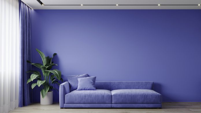
- Blues and greens connect us with nature, they create a calm, and they have a shorter wavelength, which gives a feeling of less enclosure. Light soft hues for family rooms or a balcony or terraces would do well.
- Yellows and oranges are joyful colours, they bring with it the feeling of sunshine, spring and all things bright and happy, a pop of it anywhere would do well, in your kitchen or children’s nursery or that stand alone couch.
- Pink, yes it’s often related to little girls, “pretty in pink” a flash of it can pretty up any area.
- Deep, strong colours like greys, dark blues, deep greens, evoke a feeling of relaxation, use it on skirtings, cornices, borders of the ceiling, or door frames. Just a section combined with white walls will make the perfect blend, in the bedroom space or maybe adult dens.
- White, especially water-based paints do not discolour, it is also easy to do an annual touch up if necessary. Very Practical, use white on large wall spaces.
- Bright blue skies is declared the colour of the year 2022, this colour captures the essence of freedom, the clear blue summer sky, its versatile, easy on the eye and entices us with a promise of something bright and beautiful ahead. It actually melts the walls away, connects you with the outdoors, making any space look much bigger. It reminds me of the song by Jimmy Cliff — I can see clearly now the rain has gone, all of the dark clouds have disappeared… (The endemic is in sight and life on planet Earth resumes with a new meaning.)
Making changes to reinvigorate your home by adding flashes of colour to suit the mood of the room without having to completely renovate but instead redecorate is achievable and not overwhelming.
Lets enjoy the way forward with a new avatar of peace, love and hope for the future of mankind, choose your colours, inject positivity and light into your home.
Change the mood of your home, find the synergy between your experiences and what you want to experience — all through eyes of colour.


